

Entry posted by TomE
917 views
Giving thought to the final presentation of the Layout
Hi All.
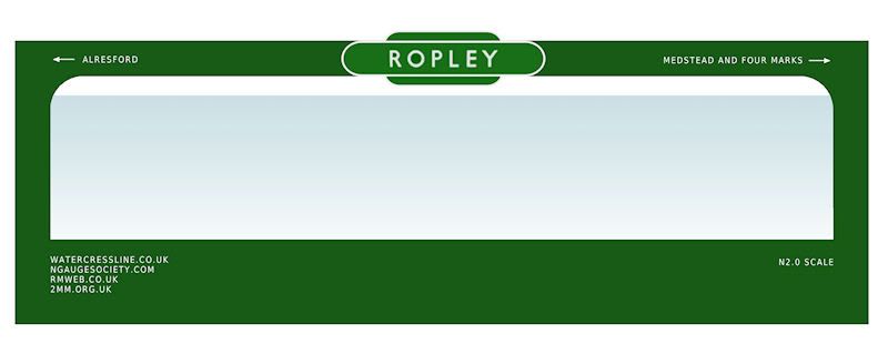
Now that the backscene is in place, I have been giving some thought to the eventual presentation of the layout. The intention was always for Ropley to be exhibitable, should anyone want it, and so it will need to have a proper frontage. To that end, I thought it would be nice to incorporate the Ropley Station totem as part of this, the only question mark being what colour to paint the rest of it.
A quick doodle in Paint Shop has come up with the following options:
Green?
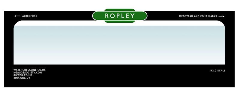
Black?
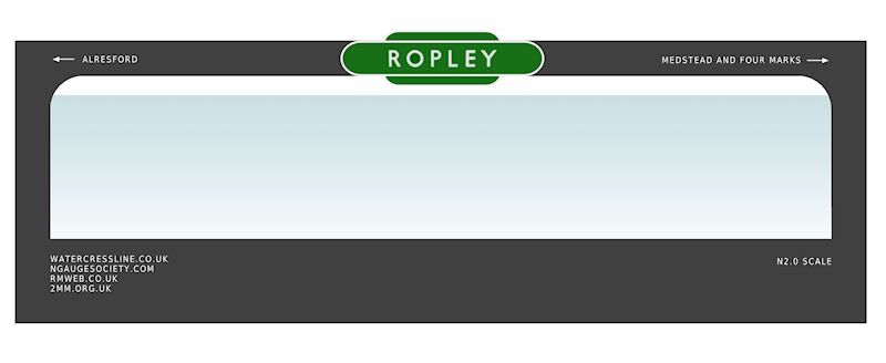
Or Grey?
I'm leaning towards Black or Green, although I'm interested to hear what others think too!
Cheers,
Tom.
-
 2
2

19 Comments
Recommended Comments
Create an account or sign in to comment
You need to be a member in order to leave a comment
Create an account
Sign up for a new account in our community. It's easy!
Register a new accountSign in
Already have an account? Sign in here.
Sign In Now