Jump to content
 

The treachery of images


Mikkel

4,130 views

P1026505.jpg


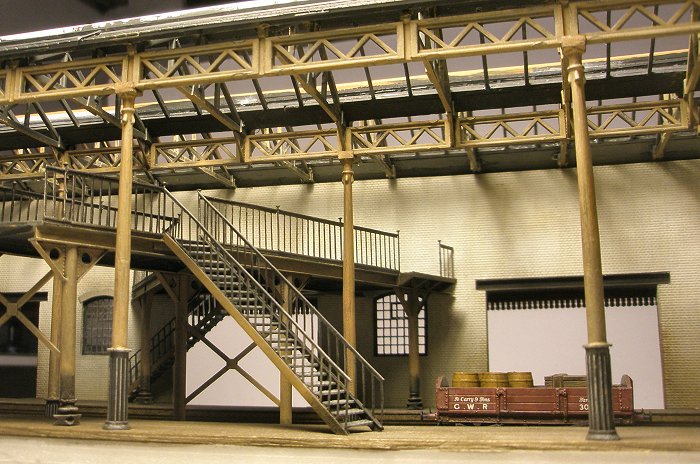
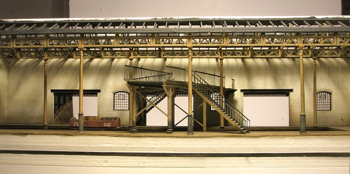
Modellers try to recreate the real thing. But sometimes we don't know how the real thing looked. Then what? These photos show my experiments with what I think was a standard livery for larger GWR goods depots around 1907, following lots of browsing of photos in books, and a brief discussion in this thread (many thanks gentlemen!).


P1026505b.jpg


The trouble is of course that photos from the period don't have, er, colour - and are full of light and shadow. So it's hard to tell grey from light stone, or light stone from dark stone, or dark stone from chocolate. Above is the same photo again, without the colour. I think it highlights how hard it can be to interpret colours in b/w photos. Also, the photos themselves are just reproductions. Alas, the treachery of images !


P1026470.jpg


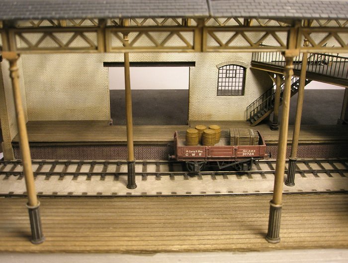
You'll be forgiven for thinking that this livery doesn't look very GWR. Neither did I at first. In fact I hated it, and thought it was completely counter-intuitive. I felt that shades of dark grey would be more appropriate. Or at least dark stone which was the preferred livery for ironwork on the GWR's public station buildings. But certainly not this BR look!


P1026485.jpg


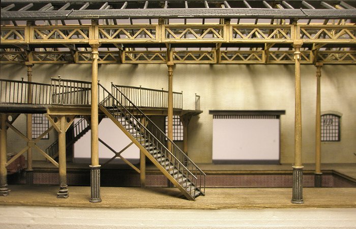
Still, the photos that I could find suggested that light stone ironwork with a darkisk chocolate base (to hide wear) was in fact common. And that it was often more clean than I would have thought. So I left it for a couple of days, and I began to get used to it. I also realized that it made a lot of sense: In a place like this you'll want things to be as light as possible.


P1026489.jpg


Looking at the results so far, I think it may need a little more weathering after all. Maybe I should also align the height of the chocolate base so that it's the same all around (at 4ft heigh?). Plus, the weathering highlights in the chocolate has made it look too grey. :scratchhead:


P1026467.jpg


Perhaps this livery didn't just apply to goods depots. Looking at photos of other large non-public buildings on the GWR at this time seems to show the same livery (see eg the photos of the Swindon Works Road Wagon workshop in Kelley's GW Road Vehicles p27)...


But then again, I fully realize that this livery may turn out to be all wrong. So, any further comments and info would be much appreciated. :mail:

  • Like 47

24 Comments


Recommended Comments

  • RMweb Premium

Sorry to be a bit of an historical Luddite, Mikkel, but in this case historical accuracy comes a poor second to the sheer quality of the modelling although I do appreciate your natural desire to 'get it right'.


David

  • Like 4
Link to comment

Superb Mikkel... there are no other words to describe your masterfulness of your hobby. Always amazing!

Jon

Link to comment

Your Farthing updates are always eagerly awaited, Mikkel. They never disappoint. Wonderful!


I shall be keeping notes and using them as reference for my own humble offering.


Best wishes,


Jonte.

  • Like 1
Link to comment

Hi Mikkel, I followed the thread on colour and I think you came too a logical conclusion. Looking at your work above I can't fault your decision, it looks right as well as fantastic and I always look forward to your blogs as I know they are well researched and of course look so good. Keep up the good work it's inspirational.


Jim

Link to comment

As usual, your modelling looks fantastic.


Colouring of anything that is beyond living memory will always be subjective I think. The red of the GWR wagons is a case in point, but your interpretation in my opinion just "looks right". I would have expected the iron work inside the goods depot to be light and dark stone in 1907, but that is just my opinon based on something I recall reading many years ago so could be wrong. I think that the important thing is that what you have modelled looks right!


Ian

Link to comment

Glad you have your mojo back. excellent work. The colours look to be sensible. I think the chocolate needs to be all one height too. Would the chocolate of been an the wall too? I know the the Southern used green on the walls upto about 4 feet.

Link to comment

Period colour can be so difficult to gauge in the absence of definitive records.


I think your approach of thorough research combined with informed reflection (eg: "..I also realized that it made a lot of sense: In a place like this you'll want things to be as light as possible.") is the only way to progress with such projects.


Either way, just to add my vote of appreciation for your work. every post you present to this forum is sublime.


My respects,


Mark

Link to comment
  • RMweb Gold

Thanks everyone for the comments and input. I know I may seem obsessive about the livery issue here, but as can be seen the columns and ironwork are very evident on this layout, so the livery makes a big impact on the look of it all.


The description on www.stationcolours.info is interesting because it says a couple of things I haven't seen mentioned before. This includes the comment that chocolate may have been used on stations (not just signal boxes) up to about 1907. I think it was Nick on here who first mentioned the chocolate at the base of columns in goods depots, and what I have seen seems to confirm this.


As for chocolate on the walls, this seems to have been a later thing from what I can tell - at least in larger goods depots. But I definetely need to add some weathering at the base of the walls, as others have commented in the past.


The light and dark stone combination is something I would also have expected, and it's certainly not impossible. But I just haven't seen photos yet where it is clearly evident. One tricky thing here is shadow, which I find can easily create an illusion of dark stone in a photo. I have seen a couple of photos where I think dark stone may have been used here and there for decorative purposes (?), but not on the columns or roof supports as I would have thought.

Link to comment

Sitting here with my copy of Edwardian Enterprise and looking again at the interior shots we discussed earlier I have to say that this looks spot on. In particular, the variation in tone of the roof trusses is very dependent on the direction of the light. This comes out particularly well in the last photo.

Well done!


Nick


ps. I had a quick play with that image by reducing the red level (a very crude approximation to contemporary film sensitivity), increasing the brightness and softening the contrast then converting to greyscale. The results were very encouraging...

Link to comment
  • RMweb Gold

Really pleased to hear that Nick, as I know you've been studying some of the same books and photos :-)


That sounds like an interesting experiment you've done with the last photo, I must try that myself. BTW I put the red wagon in there to see what it would look like in black and white. It comes out fairly light, as did the wagons in David's experiment here. But as you say in the comments on David's blog, a straight conversion from digital image to monochrome doesn't capture the emulsions of the time.

Link to comment
  • RMweb Gold

Looks completely convincing to me! A beautifully conceived and superbly executed piece of modelling. I'm hoping it will feature as the back drop, to another of your Edwardian melodramas, very soon!


Dave

Link to comment
  • RMweb Premium

Wowzer!


Brilliant, stunning and highly original as usual. You really have been busy on this one and you've solved the problem where roof meets wall with perfection. Think the wall and metal work colour match perfectly. Love that long shot of the whole model - the absolute straightness of the metalwork really makes the whole thing look completely real. Great work - raising the bar even higher!


Regards,


Mike

Link to comment
  • RMweb Gold

Many thanks for these comments :-)


Dave, I hope there will be one or two melodramatic events at some point, although the photography for the stories may prove a little tricky. All those sloping lines and things that get in the way! Fortunately the columns can be temporarily removed to allow room for a small camera.


Mike, yes many thanks for the input on the roof-meets-wall issue. The whole roof can be taken off very easily now. Will take some photos once the painting's done.

  • Like 2
Link to comment

Hi Mikkel,


I haven't looked in on your blog for a long time but I am glad I did today. This is absolutely top draw modelling - well done!


All the best,


Castle

Link to comment
  • RMweb Gold

I'm late to this thread but with over 35 likes Mikkel it can't be far wrong.Top modelling.You never disappoint my friend.

Link to comment

The atmosphere feels right, and the only 'colour' that jars is the pristine state of the ballast, which needs darkening.


Lights? Pendant hanging things? Presumably gas mantles?

Link to comment
  • RMweb Gold

Thanks everyone - really good to hear you like it as I've been very uncertain about this livery. We are our own worst critics and I can see a number of details in these close-ups that need adressing.


Miss P, must I really weather the ballast? :D I have a thing for light dusty ballast like this and I like how it's come out. But seriously, now that you mention it I think you are right. Notes taken!


As for lights: I've begun looking into this and am aiming for gas lamps. I'll probably take my cue from an Edwardian photo of Paddington in "GWR Goods Operations" which shows quite a mix of styles. In the photo there are lamps mounted on the columns along one deck, and hanging lamps along another, which would suit me nicely. Missy introduced the idea of working lamps but I'm not sure I'm up for it. Let's see.


Not sure about the source of lamps. I have yet to find readily available 4mm hanging gas lamps. I am thinking of chopping up some cheap Hornby platform mounted gas lamps and just using the lamp itself. Unless anyone has a better idea?


http://www.Hornby.com/shop/skaledale/r8673-platform-lamps/


Link to comment
  • RMweb Gold

Thanks for that Miss P. I haven't noticed such an arrangement of apertures before. I wonder what the advantage would have been. To keep out rain and wind?

Some interesting goods too. I'm hoping to replicate a bit of the diversity of packing crates etc, but it will need to be scratchbuilt as much of what is currently available in terms of crates etc is rather unimaginative and does not reflect the diversity seen in photos like these. And this is even quite late in the period, earlier on the diversity was extraordinary. It will be fiddly work though!

Link to comment

Create an account or sign in to comment

You need to be a member in order to leave a comment

Create an account

Sign up for a new account in our community. It's easy!

Register a new account

Sign in

Already have an account? Sign in here.

Sign In Now

×
×
  • Create New...