


Will Vale
-
Posts
996 -
Joined
-
Last visited
Content Type
Profiles
Forums
Blogs
Gallery
Events
Exhibition Layout Details
Store
Blog Comments posted by Will Vale
-
-

Thanks folks, you might be right about the lines Rich - I went through my photos and one of them is actually in a prototypical spot.
James thanks for the tip, is that what they call decanting? I'll probably need to touch up some bits even if I leave others, so I'll give it a go.
-

Very tidy work. The idea of using solid/stripes as paired feeds is neat, must see if I can get hold of striped stranded hookup wire.
I'm also glad that "frogs are green" is a common convention - I use that one following a joke article in MR

-
I find it really hard to summon the energy for modelling in Autumn and Winter, I'm much more a Spring/Summer person. Maybe it's the light, or maybe I just don't spend enough time outdoors!
-

Sorry, I was a bit over-confident in assuming it was etched brass! Very clever use of materials. I didn't know you could do 'half etch' with a laser.
-
Wonderfully crisp, and those lines are very fine. I'm guessing the red primer was a typo, else where would the white come from?
-
Great idea! I've been musing for years about a micro layout with WHFB dwarves or goblins shuffling treasure around a dragon's horde in Hudson Ruggas
40K sounds like a great pairing with trains - transporting Inferno shells or other munitions, Ork armoured trains with rams and boarding ramps...
Keenly awaiting plans and pictures!
-
 1
1
-
-
Thanks Frank! I was lazy and didn't write the exact colours I used - all Games Workshop acrylic bar the initial undercoat which was tube acrylic. To remedy that:
Adeptus Battlegrey (dark), Astronomican grey (light), Dheneb Stone (concrete) and their "Skull" White.
In smaller quantities, the yellow is Iyanden Darksun, the pink is Tallarn Flesh.
You could mix your own equivalents, but I find sometimes it's a helpful shortcut to use premixed colours if I'm not doing all the painting in one session - I guess taking notes would work too but I tend not to think of that while painting
One interesting result is that drybrushing slightly shiny darker grey over the lighter matt undercoat gives a nice polished stone effect - a rough surface in recesses, with the bare stone revealed on edges. I'm not sure it's very 'scale' but it sort of works for earth and grot lying in the crevices..
-

Great image - you can feel the warmth just looking at it. This drain on Catcott Burtle, coupled with my liking of the Netherlands, is a big part of why Whitemarsh has a drain along the front
Lovely attention to detail with the staining on the concrete. -
Thanks Jamie, that's a good point. In theory the hall we're in has a high part-glazed ceiling, in practice I recall it's rather dirty, and leaks, so I need to remember to get a plastic dust sheet!
-
I had to have a quick go with the light fitting I bought - this is a non-mechanically-sound installation using masking tape to attach the pelmet, and to attach the light fitting to the pelmet... But it's certainly bright - this was taken in a nearly-dark room. The shadows on the mountains are a bit strong - the pelmet is 5cm in front of the layout - but I think that will probably be OK since it's framing rather than a focal point. I'm waiting on another, longer, fitting which will daisy-chain with this one to fill the length of the pelmet.
-
1
-
-
I try to keep things small, and fail. Tanis was nice and small, at least.
I've posted some state-of-play pics, they show the whole thing and some of the areas. I also got a T5 light fitting today to play with - looks promising!
-
Oo-err indeed, I'm getting nervous that this is going to turn into a two-person lift when I get the profile boards on all sides. It's not especially heavy, but it is rather bulky.
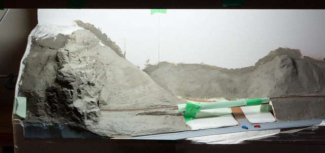
No helices/helixii/spirals, just sharp return curves with a ~6" wide fiddle yard at the back. All the track is on one level since my experiments with gradients were less than encouraging and I'd like to run long trains. The lack of gradient is probably the single biggest compromise in the whole project!
-

This is a lovely layout, you must be sad to see it go. It's also one of the few (the only?) layouts on RMWeb that I've managed to see in the flesh, it was a real treat.
-
focus this deadline has given you on this project.
Deadlines are wonderful, terrible things. I'm not much good without them, but I end up so tired after that I want to give up modelling until the next deadline looms.
A cow with wings! A flying cow!
(I'd never seen one up 'til now.)
"Oh Daisy dear, can this be true?"
She flapped her wings, and up she flew.
-
Thanks chaps. I am pretty happy (although big pics are always startling - you see much more than with the naked eye!) I just wish I'd done it all at once since the finish on the end wall is a bit better than on the wing wall. I'm really pleased with the honey-coloured coping stone though, using black undercoat was a good experiment there.
I notice you have one of those stippling brushes with short hard/stiff bristles. How are they?The small brush I have in that picture is one Games Workshop sell particularly for drybrushing - I have a stippling brush too but it has noticeably stiffer bristles. The GW drybrush is great, I'm still on my first one and it hasn't deteriorated at all. The bristles have a nice spring so you can get different effects by varying the pressure. Their big drybrush (about 3/4", also in some of the pics above) is a useful time-saver but it's a bit more expensive. Still cheap for a tool I use all the time though.
I used the stippling brush for doing the interiors for various ballast wagons with tube acrylics. It leaves a nice imprint in the paint and it's great for blending wet-on-wet paint without making it all look soft and unnatural. This one is all done with a stippling brush and three or four basic colours, with Klear added after for the puddles.
I recall being inspired to try this by a post Martin (Pugsley) made before I joined the forum - I think he'd done some PNA interiors with paint + talc?
-

I hadn't seen this one before although I had heard the name - very catchy. I think the sense of space is really good for a shallow layout.
Putting it on the shelf seems like a good idea - much more fun to have something that runs reliably so your 20 minutes playing trains doesn't become 20 minutes of swearing and prodding. Particularly if you're braving the finescale world - I think boxfiles with something like Kato track would be quite reliable since the track bed connects together securely, but then you're stuck with Kato track.
-
Thanks Mikkel! I'll see if I can get some in-progress pictures of the painting of the next bit, it's basically drybrushing over a black undercoat though.
And you're right, it's a toothbrush - one of my daughter's cast-offs which I use for brushing the dust away. It probably has Ariel the mermaid on it
-
It's a new thing for me, I haven't tried it before this project, but it's less bad than I expected it to be. I was drawn to trying it because I couldn't find anything close to the random stone on some of the tunnel portals.
I'm not a complete masochist though - I've got about five feet of retaining wall along the road which is going to be cut from a sheet of pre-embossed foam from a shop
-
The flatbed is gloriously silly, more please!
Do you have any plans for figures yet? I imagine there isn't much in the commercial ranges which would be appropriate.
-
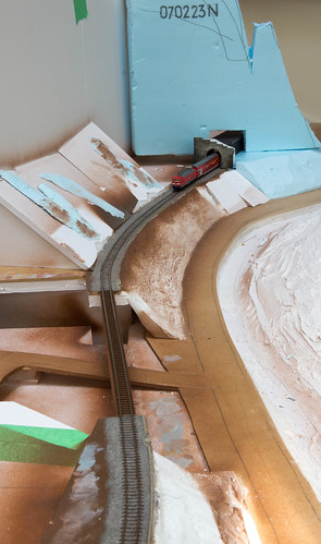
Thanks for the kind comments, I'm definitely keen to make it look bigger than it is - the code 40 rail is a good start I think, and the B&W photo goes some way to hiding the enormous coupling on the front of the loco...
you may have discovered a solution to the problem of simulating non-loco wagon shunting!Now there's a thought. I have an old issue of MR somewhere discussing techniques for propelling boxcars in hump yards - maybe the vacuum cleaner is the answer they were looking for?
-
1
-
-
I rather like the outside version of the colours, especially in the first shot. Your backscene is supremely effective.
Agree about the loco, it's gorgeous. As are those fishplates, I must find and fit the ones I got for Whitemarsh.
-
Cheers chaps! On the integrating photos thing, I actually tried feeding them into Photosynth to see what happened, but there wasn't enough consistency in the data. I think it really needs pictures taken on the same day, and ideally with the same camera. Having to make do with the Mk. 1 Noggin.
-

Looks very tidy and fine-grained. Is the Normandy Earth stony, or something softer?
-
1
-
-
Thanks for the kinds words! I maybe didn't explain the trees thing very well - the slopes below track level to the road are mostly bare barring a few shrubs and saplings. It depends on the period though - it was pretty bushy in 1970s and 1990s images. This means there's usually good line of sight to the trains. The slopes above are heavily wooded, which makes them look steeper than they are - you just see the line of tree trunks and foliage.
The fallen tree idea is a good one though, and could work on the other side of the valley which starts climbing up towards the front of the layout. I want to encourage people to look into the scene from the ends (hence the river and road providing a good leading line) so maybe thinning or felling the foreground trees away from the middle will help. That'd be the bit on the right here:
Mikkel, you're absolutely right, this is a much bigger undertaking than I thought. I was subconsciously comparing the ~six square feet of layout with Whitemarsh's eight, and thinking that was all that mattered. But the cubage is so much bigger for this one - East Anglia is relatively free of sticking-up bits, the Höllental by definition isn't...
-
1
-


Dear Diary, today I wired my layout.
in Will's workbench
A blog by Will Vale in RMweb Blogs
Posted
Good question. I will endeavour to fix.